Depending on how much work your website needs to be truly mobile-friendly, you might want to hire a web developer. However, there are some steps you can complete yourself. Google suggests the following ways to improve your site’s responsiveness and user experience on mobile devices:
Visit Google’s guide to mobile-friendly sites. This page offers several ways to make your site more mobile-friendly, such as choosing a responsive web design that automatically adjusts the display to fit different screen sizes.
Take Google’s Mobile-Friendly Test to see how optimized your website is for mobile viewing. You can test a single page on your site or several webpages and see exactly how Googlebot views the pages when determining search results.
Use Webmaster Tools to generate a Mobile Usability Report, which helps identify any issues with your website when viewed on a mobile device.
To get the best results from mobile, Palazzo advises small businesses to leverage browser caching, minify JavaScript and CSS, compress images to decrease file size, utilize Google’s AMP pages, and make sure all extensions are in place.
When the mobile version of your website is complete, it should fit perfectly on any mobile device screen size, whether it’s a mobile phone or tablet. The design of the site should suit the user’s typical activity on that device as well, which usually requires employing a separate design than your desktop version.
If you buy a new phone and it doesn’t ring do you blame Apple? Or Samsung or any of the other brands for that matter, the reason your phone doesn’t ring is not enough people know your number…
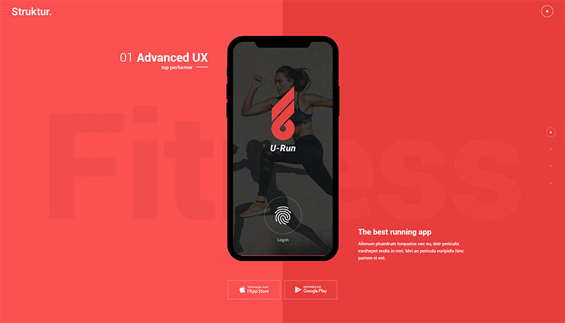
You could also consider offering a mobile app. If your business’s goods or services are well suited for it, an app offers users a mobile-specific way to engage with your brand and creates new opportunities for capturing mobile visitors.